|

The Pivot Table tool featured in AVAproject Fusion allows users to easily create a virtually unlimited number of tables and data comparisons – all using data from existing projects.
Pivot Tables have been a popular feature of many data-driven software packages, from its first incarnation in the 1991 release of Lotus Improv, to the ubiquitous Microsoft Excel which first offered the feature in 1993. Many users may initially find the notion of using Pivot Tables a bit off putting, because of their apparent complexity; but nothing could be further from the truth.
A Pivot Table is nothing more than a means to compare one set of data against another. For example, one may wish to chart the usage of a given manufacturer's products for each estimator in their organization. In this case, the table can be imagined as an X-Y chart, with the estimator names listed along the top (the 'X'), and manufacturers listed down the left side (the 'Y').
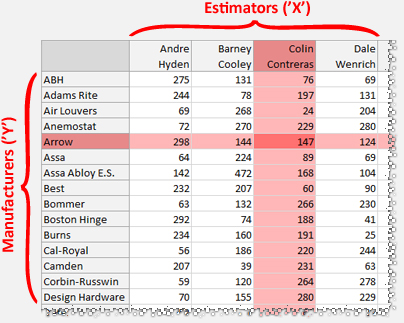
A basic Pivot Table with estimator names listed across the 'X' side, and manufacturers listed down the 'Y' side. Red highlights added as a visual aid to show that estimator Colin Contreras supplied 147 Arrow products.
|
At each point of intersection, one could display a total count of all the products supplied by the given manufacturer that were used by the given estimators. They could also choose to display a total dollar value, or any other numeric value contained in the database. |
This same Pivot Table could be changed slightly to show usage by 'project' instead of by 'estimator', or a combination of both. Each of the these data fields ('Manufacturer', 'Estimator', 'Project', etc.) which are used to build the report are referred to as "data points". This ease by which views could be changed or "pivoted" is where the report gets its name.
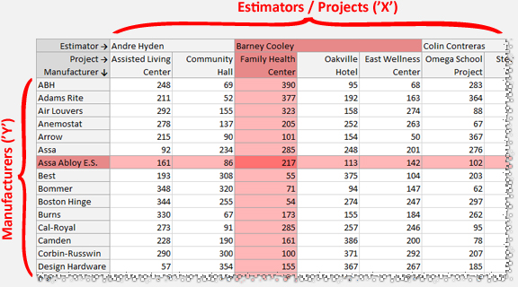
A simple variation of the first Pivot Table sample: Adding in the Project Name data point to be broken down per Estimator. In this example, it is easy to see that of the 472 Assa Abloy E.S. products supplied by Barney Cooley (as shown in the first example), 217 of them were supplied for the 'Family Health Center' project.
There are countless different pieces of data one may wish to chart against others in the normal course of business, and Fusion Pivot Tables makes this task incredibly simple.
Pivot Tables vs Standard Reports
One might understandably wonder why they would choose to use a Pivot Table rather than a standard 'columnar' report (also offered in AVAproject Fusion). After all, both provide similar - if not identical information. The answer is one of simplicity and readability. Using our first example, one could easily generate a reports showing hardware used in a project and group the data by estimator. The linear nature of the report, however, makes point-to-point comparisons considerably more tedious. The Pivot Table lines up the data for "at-a-glance" comparisons of data on either edge of the chart.
AVAproject users are encouraged to experiment with different reports and data comparisons using pivots tables in addition to traditional columnar reports. Future editions of AVAwire will contain articles that expand upon the concepts introduced in this article. In addition, a series of overview videos are planned for Pivot Tables and other advanced features of AVAproject Fusion; please subscribe to the AVAware YouTube channel to be immediately informed of their release.
|